DataVisualization Projects
At Continente 7, an Algorithm Factory
DataViz Presentation / Software: Consumer Confidence Index Tool & Forecast Accuracy Slicer
// DataViz Presentation

Introduction to Data Visualization, Technologies and Interactivity

A Conference I prepared for the C7 Jam Programme at ContinenteSiete, an Algorithm and Business Statistics Consulting Company!!

Thanx to everybody at C7..!!

www.continentesiete.com

// During the presentation, at Continente 7 's HeadQuarters.

// Consumer Confidence Index Tool

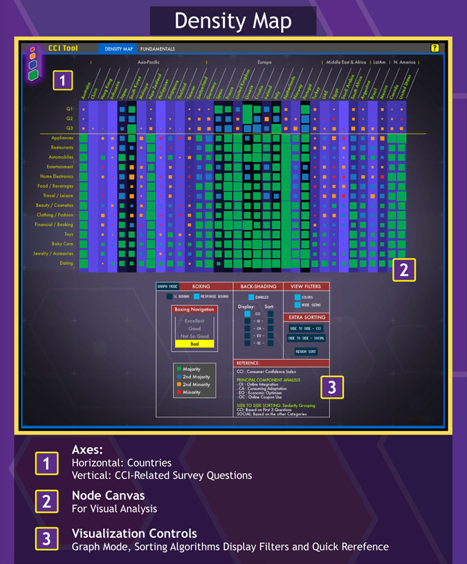
Interactive Application for the Visualization of multiDimensional Consumer Confidence Index Poll data. It enables the analist to display data using a variety of filters, sorting algorithms, and view options.

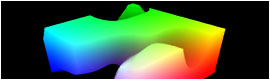
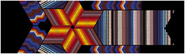
It consist of 2 main configurations: The Density Map, and the Fundamentals Map. 
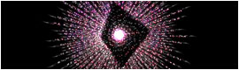
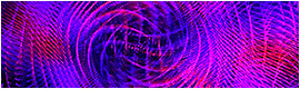
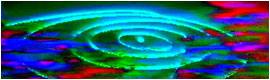
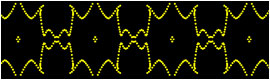
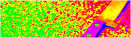
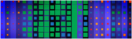
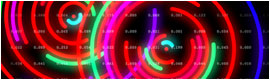
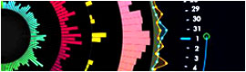
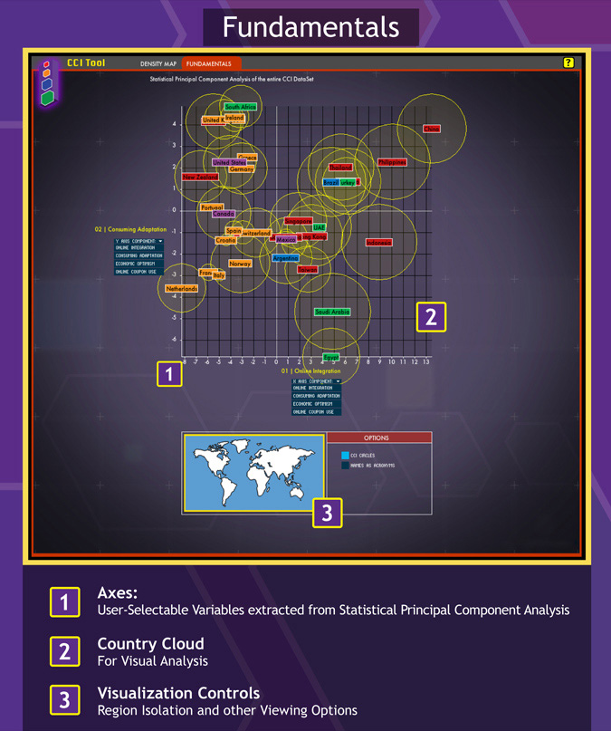
The tool's Density Map Mode aims at raw data display and analysis, focusing on visual pattern recognition, while the Fundamentals Graph Mode allows for a big picture, a qualitative viewpoint.

Combined, they generate a data exploration platform for complex data that allows the analyst to combine its previous knowledge of the field in question, with a fluent data navigation and sorting, along with the capacities of the primitive visual cortex, excellent in visual processing, in order to make sense of Big Data.

Check out both videos:
1 - Data Insights Showcase
2 - Tutorial and Walkthrough

// Download the Project Documentation


Project Lead, Graphic Design and Coding:
Agustin Ramos Anzorena

Coding, Sorting Algorithms, Data Analysis and Video Script/Narration:
Federico Bennett
federico.bennett@gmail.com

Principal Components Analysis:
Juan José López Murphy
juansh@gmail.com

Aditional Coding:
Marina Pérez Gaido
marina.perezgaido@gmail.com

Coordination:
Andres Agres and Juan Pablo Rodriguez Varela

Additional Help:
Everybody at Continente 7 (www.continentesiete.com)

// Density Map

// Fundamentals Map

>
// Forecast Accuracy Slicer

The Forecast Accuracy Slicer is a tool to quickly load, compare and navigate a structural data that was inherently cross-Dimensional. It’s purpose is to aid in the understanding of the linked bi-Dimensionality of the data, and it’s importance during analysis.

The FA Slicer allows for the creation of simple line graphs that can be compared by inserting other small graphs in-between.

But more important, the tool is able to explicitly show dimensionality by mapping instances of the data (corresponding the database crossDimensionality) into a 3D cube that can rotate in space, allowing the analist to quickly understand across which layers he is working on.

// Various Graphs with crossComparison mini-graphs

// Animation explicitly showing the bi-dimensionality of the data analysis

// Creating new Graphs

// Logo Design for Continente 7's Data Visualization "wing"